RETAIL
An online grocery store
CLIENT
Interspar.at
2015 — 2016
Honorable mention to this design, as it’s still online after 7 years.
CHALLENGE
Redesign of 3 eCommerce websites, selling 3 different product categories. The project started with the redesign of the Grocery one, then followed by the Marketplace (Electronic & Kitchen items) and finally the Wines store.
(In German!)
STRATEGY
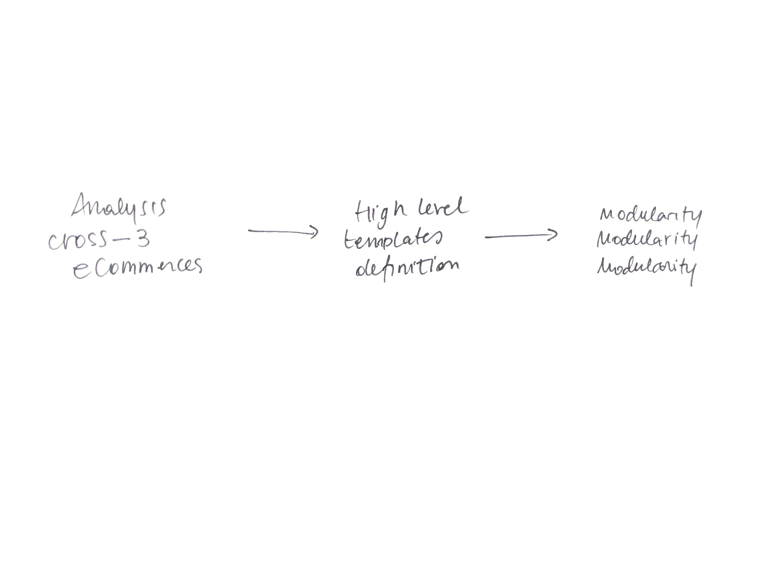
Understand the core similarities between the stores, design a flexible product box who could fit all the different items. Define patterns and common interface elements to achieve consistent user experience, keeping in mind store differences.
CHANNELS
Website, iOS & Android app.
FEATURES
Buying from bananas to a luxury bottle of wine, having a look at TVs too.
PERSONAL NOTES
This has been my first eCommerce project, and I loved it. I realised right after that retail was the industry I wanted to focus on. I learned while doing from other experienced designers, until the end of the project, where I took the lead on the UX side of the things. Also, I figured that every minute spent in research worth more than a hundred sketches.
Design Process
The design process started with the experience definition for the eGrocery website. The initial phase has been focused on competitors benchmark, stakeholders interviews and then the production of a low-fi prototype, to quickly understand which was the new potential structure of the website.
From the low-fi prototype we collected useful insights and, since the design process had just started, we were able to fix quickly some important aspects and define more precisely the structure.
The approach was so successful that we were involved, afterwards, in the redesign of 2 additional websites, one selling household items, and the other one selling wines and spirits, with one strong constraint: only one development was budgeted for all 3 websites.
A product box for 3 stores
Design a flexible product box it’s been at the heart of the design.
Selling a bottle of wine and a TV with the same design molecule has been a challenge since the product attributes were very different.
Plus, since the development has been 1 for all the 3 eStores, grids and responsive logics needed to be identical.
Some of the main aspects took in consideration when designing the product boxes:
GROCERY
Can be discounted or not
Can have many attributes such as Fairtrade, Bio, etc…
Multiple weight choices: Grams (100, 200, custom), Quantity
You can add it to your personal lists (recurrent purchases)
WINE
Need to communicate the country & area of origin of the wine
Can have multiple awards based on specialised magazines
Need to know the year
Can have very long names (up to 3 lines!)
HOUSEWARE
Can have many tech attributes
Goes from Lego to a TV to a fork
Has reviews
Websites went online gradually, with the Grocery as first, helping us in already refining some behaviours, and then Marketplace and Wine, considering also an MVP and release map.


